Client
Hayling Island Coffee Society (HICS)
Project Type
Branding & Packaging Design
Description
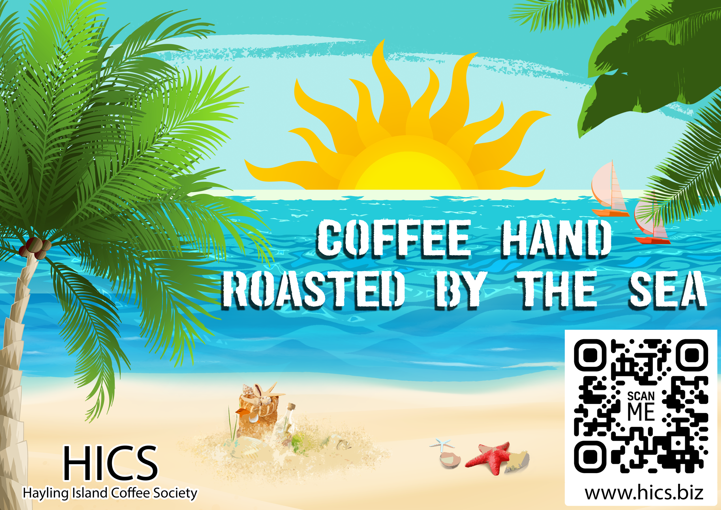
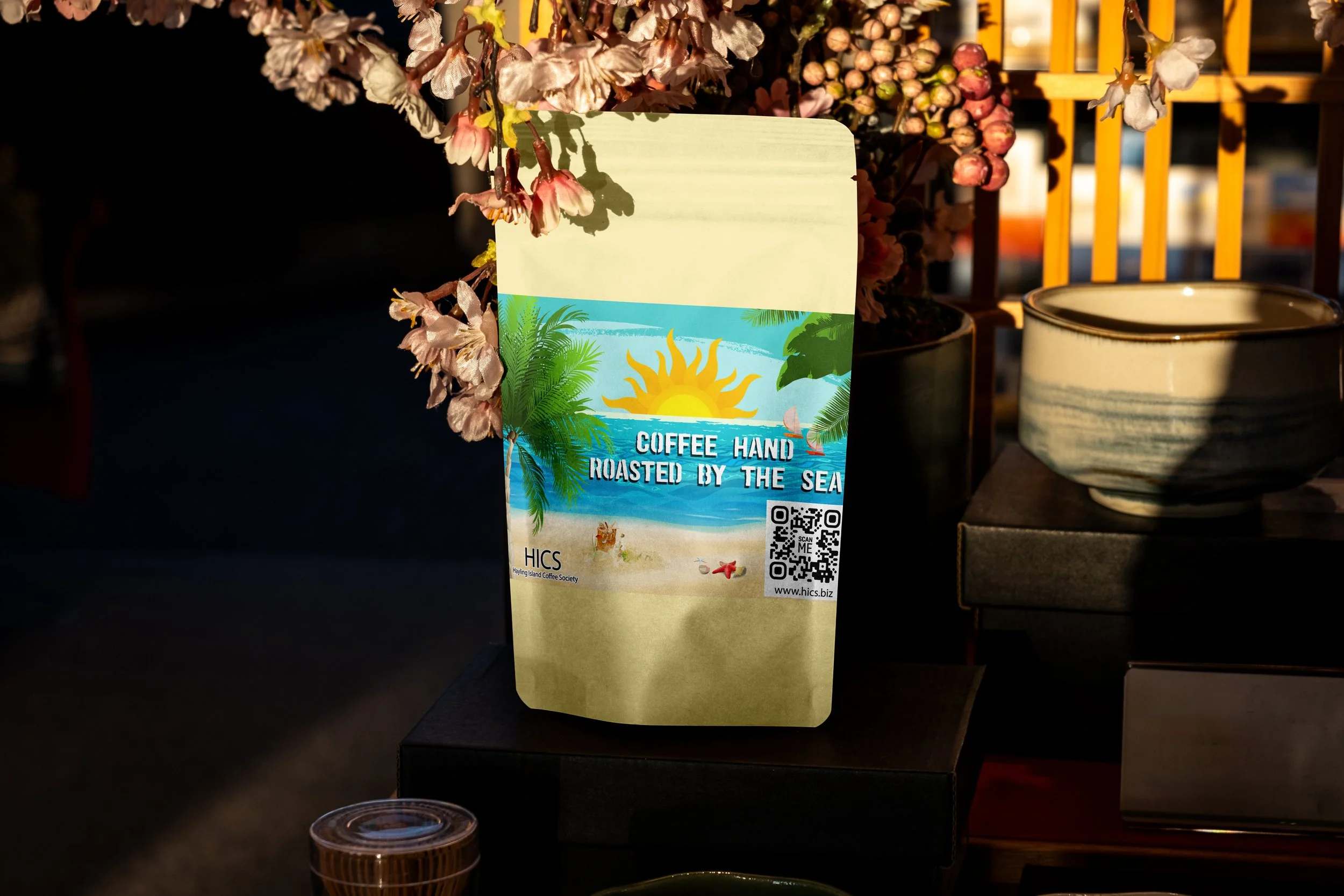
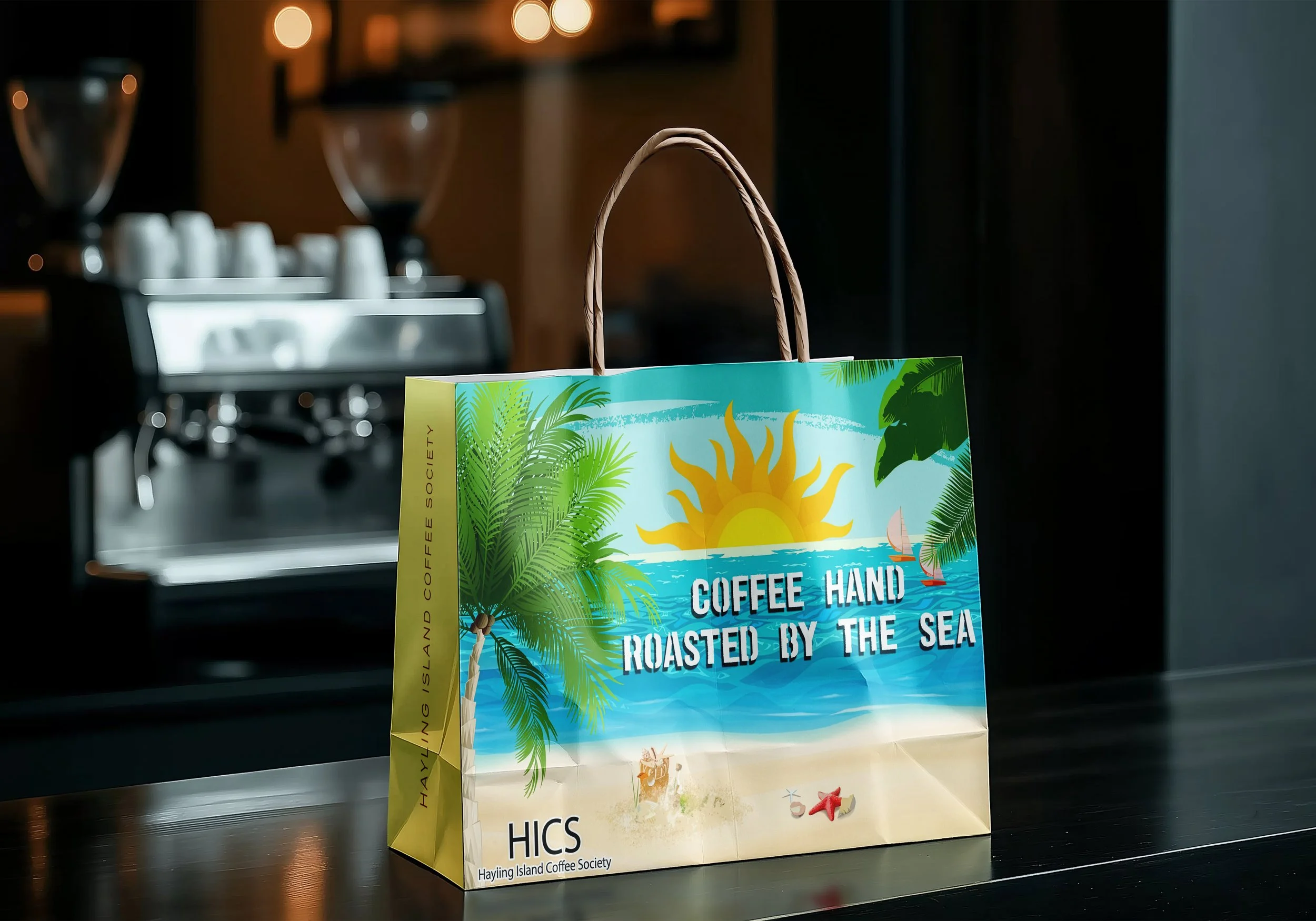
Hayling Island Coffee Society commissioned a limited-edition label redesign for a summer event, aiming to move away from their usual low-saturation palette towards a more vibrant, seasonal direction. I developed a refreshed visual approach that maintained brand recognition while introducing bold colour and energy to reflect the event’s atmosphere.
To support extended use across merchandise, I designed two label variants: one tailored for packaging with full information, and a simplified version adapted for mugs and paper carrier bags, allowing the visuals to function more effectively as illustration. The project delivered a cohesive and adaptable visual outcome across print, product, and motion.